DAVID'S BISTRO

David’s Bistro is a traditional style French bistro located in London,
Ontario, with the emphasis on seafood and other aspects of food.
They have a daily prix fixe menu, regular menu and daily features.
They have a fine dining/wine and dine atmosphere with a warm
welcome, cool jazz, interesting affordable wines, attentive service
and of great food.
Ontario, with the emphasis on seafood and other aspects of food.
They have a daily prix fixe menu, regular menu and daily features.
They have a fine dining/wine and dine atmosphere with a warm
welcome, cool jazz, interesting affordable wines, attentive service
and of great food.
I was tasked to do a re-brand of David’s Bistro with a new identity
that generates ‘positive and favorable awareness’ in the marketplace
such that ‘sales’ are generated and develop a brand style guide and
other deliverables that correspond to the corporate identity that
was designed.
I developed the foundations of the brand style with a strong and
elegant logo & icon, a royal blue and gold colour palette that suits
the atmosphere and values of the restaurant, and designed all the
materials and supplements such as stationary items, food truck, and
even a mascot based off of the aesthetics and designs created.


JOHN K - I'M STILL LEARNING HOW TO LOVE
John Poulson Keyser, known professionally as John K (formerly stylized as JOHN. k), is an American pop singer. Orlando, Florida, U.S.
For this project, I was tasked to create an album cover for his title track “I’m Still Learning How to Love” that is adaptable for printing physical copies and social media promotions through Instagram and Spotify. The direction that was given was to create a simple and minimal design that can be used as the main icon for
promotional materials, while adding some elements of rough/ripped paper textures to represent the difficulty of telling someone you love them.
promotional materials, while adding some elements of rough/ripped paper textures to represent the difficulty of telling someone you love them.
I created the main heart logo through Illustrator and added other effects and elements, as well as all the mockups for the merchandise in photoshop. I captured the idea of repeating and perfecting the songwriting process through overlaying the main logo icon over the paper that includes handwritten lyrics.


ZONED OUT BREWING CO.
Zoned Out Brewery Co. Is a fictive brand of alcoholic Drinks. It’s
one of Canada’s best individually handcrafted fine ales and lagers
located in the heart of Downtown London. Zoned Out Brewing is
a microbrewery that values unmistakable complexity and balance
when it comes to drinking quality beer. It pays unrelenting attention
to every single detail of the brewing process – and we hope it shows.
Although it’s quite a new and small business as of right now, they
provide BIG flavors and guarantees to get you back in the zone after
you sit down, relax, and have a cold one.
I was tasked to create a unique style for this brand to help promote
and generate sales through unique illustrations and bold colours. I
wanted to keep the illustrations simple and minimal with abstract
themes of feeling “Zoned Out” while including bold colours in
the background to differentiate the brands’ diverse flavours. The
contrast between the characters and colours perfectly showcases
the strength and taste of Zoned Out Beer.


RASHIDI KABAMBA - RKEASE CO.
RKease, also known as Rashidi Kabamba is an entrepreneur I connected with during my time as a Creative Assistant at Fanshawe LeapIn. With a bright and enthusiastic personality and a passion for music and mental health, Rashidi built a business on creating jingles and incorporating music to promote liveliness, joy, and reducing stress within the corporate workplace.
I was tasked to create a logo that showcases his unique vision of being a professional business that focuses on music. I wanted to showcase the ups and downs and flows through breathing, and through music. This theme of flows and calming waves represent who he is as an entrepreneur and we wanted to showcase these themes in his social media platforms. I was tasked to create the first 12 posts and templates where he would be promoting his business as well as educating his audience about mental health and stress.




TURTLE CROSSING MEDIA
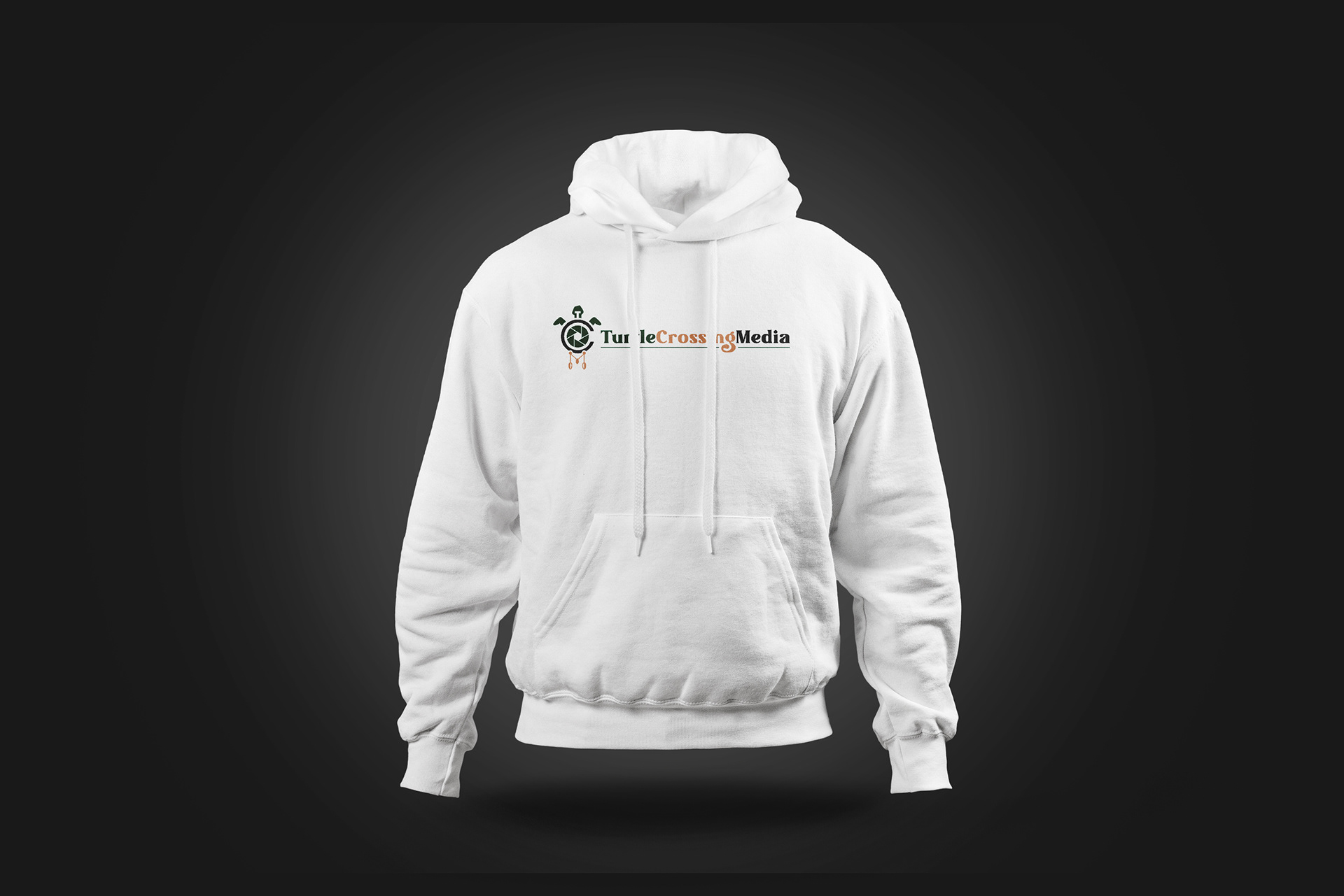
Turtle Crossing Media is a group of 4 Indigenous individuals who graduated
Fanshawe College with different degrees varying from business, marketing,
sound production and film. But one thing they have in common is a combined
passion for storytelling and helping small indigenous families and business
through the art of filmmaking. This is a business that I was also able to help out as a Creative Assistant through Fanshawe LeapIn.
I was tasked to create a brand that showcases their indigenous roots, creativity, and incorporating an element that promotes their passion for films. I combined all of that using the acronym TCM in their logo. T which is shown with the turtle for their name, a C for the body of the dream catcher which represented their indigenous roots, and the M for the strings and feathers that are attached to the dreamcatcher. For the netting in the middle, I included a camera aperture to represent their passion for film.




INTIMATE BACKYARD EVENTS
Intimate Backyard Events is a married couple who offers services on providing clients with wedding ceremonies through design and rentals while relieving the stress associated with rental guesswork and logistics. They focus on collecting unique pieces that bring a lovely, cozy, and elegant feeling to backyard weddings with the belief of being able to make special memories in small and intimate moments and settings.
I met Mac and Chris, the couple behind this business during my time at Fanshawe LeapIn where I became their Creative Assistant for a short period of time. I was tasked to create a logo and some colour palettes that give of elegance, simplicity, and showcase an idea of celebrating small intimate moments. I used calligraphy matched with a light serif font as the main features of the logo and a firework/champagne confetti as the main iconography.




OISHI RAMEN
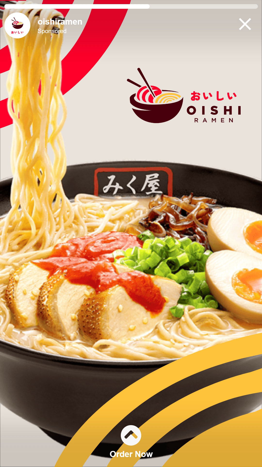
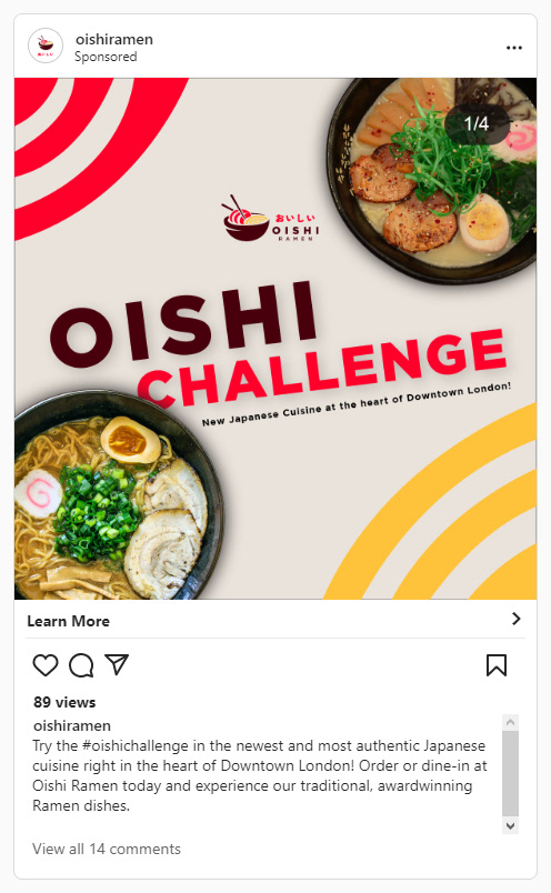
Oishi Ramen is a fictive brand of authentic Japanese food specializing in traditional Ramen. It is located in the heart of downtown London, where the locals and the businesses around the area thrive off of the various food options and Oishi Ramen would like to get foot traffic on their social media platforms and their website and drive customers in the restaurant as they open their services to the public.
I was tasked to deliver a brand style that is simple and trendy within the Japanese cuisine aesthetics, create a wire flow and a prototype of the website, and create social media advertisements to promote the restaurant, the specialty Ramen, and the “Oishi Challenge” where the customer would get a discount on their first 3 orders and 5 free meals if they are able to finish one of their specialty super sized ramen within a certain time period.
The signature red and yellow really stands out against the brown and beige backgrounds, and it represents their specialty pork shoyu and noodles within the logo which can be used in other graphic elements, such as posters and social media advertisements.





RUPERT FABROS - CREATE
I’m a graphic designer who needs stationery packaging in the future, and I’ve had an interest in being able to express my creativity into making some apparel for people, so I thought I’d go into this and take advantage of this project and build up my personal brand as its something that I will take with me now and as I build my design career in the future.
Create is a “sub-brand” of my personal brand. I thought the apparel on its own should have its own life outside of Rupert the Graphic Designer so CREATE came and the tag is a mantra that I’ve been living by and it’s something that I hope inspires other creatives out there. Live by Design and not by Default. I know for myself sometimes I feel unmotivated or doubtful about my work and I really want to push myself to just create and get stuff out there because that’s ultimately how you grow as an artist and designer, and I hope that’s something that inspires other designers and creatives as well. Living by design and not by default just means that there’s always room to improving something whether that be
a product, a design, an idea, and more. Breaking out of our comfort zones and improving what’s already working should be in the back of our heads as creatives.
a product, a design, an idea, and more. Breaking out of our comfort zones and improving what’s already working should be in the back of our heads as creatives.
Art is constantly evolving and so should we.


PEELIN' LUCKY: CHERRYHILL MALL SALES PROMOTION GAME BOARD


ORAL HEALTH & WELLNESS CLINIC at FANSHAWE COLLEGE






ST. MARY'S HIGH SCHOOL - 2023-2024 STUDENT CUNCIL


