A Canadian favourite since 1904, Canada Dry® Ginger Ale is the smooth, refreshing taste that’s as crisp as a morning spent on the lake. Made with 100% natural flavours including real ginger flavour, it’s a classic for a reason. I was tasked to do a photoshoot for the beverage and create a billboard advertisement. The preparation for the shoot included taking the ginger ale can against a black background and lit with two studio lights. I spritzed it with some water to give it the effect that it was cold and chilled previously, and I took the raw images into Lightroom. After making some final retouching and edits, I took it into photoshop where I developed the rest of the billboard design.
I wanted the ginger ale can to stand out with it’s green colours and highlight it’s taste and refreshing feeling by having it splash in some water. I focused on simplicity and boldness when it came to the typography and the background so that it doesn’t take away from the colours of the can. This billboard design is minimal and effective for the people speeding by in their cars.


Helvetica is a 2007 American independent feature-length documentary film about typography and graphic design, centered on the Helvetica typeface. Directed by Gary Hustwit, it was released in 2007 to coincide with the 50th anniversary of the typeface’s introduction in 1957 and is considered the first of the Design Trilogy by the director.
I was tasked to create a series of posters to promote the screening of the documentary film in TAP - Centre for Creativity in downtown London. The goal was to use the Helvetica typeface in interesting ways, include all the details and body copy, highlight some of the typeface’s swiss background in the design, and showcase some of the highlights and main points in the film such as the the main creator of the typeface, Alfred Hoffmann, how it’s shown and utilized everywhere like the New York city subway lines, and some of the “bad habit” designers have when it comes to utilizing this typeface.
Spider-Man: No Way Home is a 2021 American superhero film based on the Marvel Comics character Spider-Man, co-produced by Columbia Pictures and Marvel Studios, and distributed by Sony Pictures Releasing. It is the sequel to Spider-Man: Homecoming (2017) and Spider-Man: Far From Home (2019), and the 27th film in the Marvel Cinematic Universe (MCU). The film was directed by Jon Watts and written by Chris McKenna and Erik Sommers. It stars Tom Holland as Peter Parker Spider-Man alongside Zendaya, Benedict Cumberbatch and Jacob Batalon.
I took the concept of the movie and created a simple illustration that highlighted the movies main plots and hidden Easter eggs. I wanted to create a retro feeling with this poster with simple shapes and flat colours. The New York skyline is duo toned and filled with organic shapes. I wanted to create depth with the silhouettes of the people pointing up and taking pictures of Spiderman and have him be in the center of the frame to create the feeling of him being surrounded by both the buildings and the crowd of people. This created a strong focal point with him being centered and created contrast from his signature red suit that he wears in the film against the cool coloured theme that the background is coloured with.


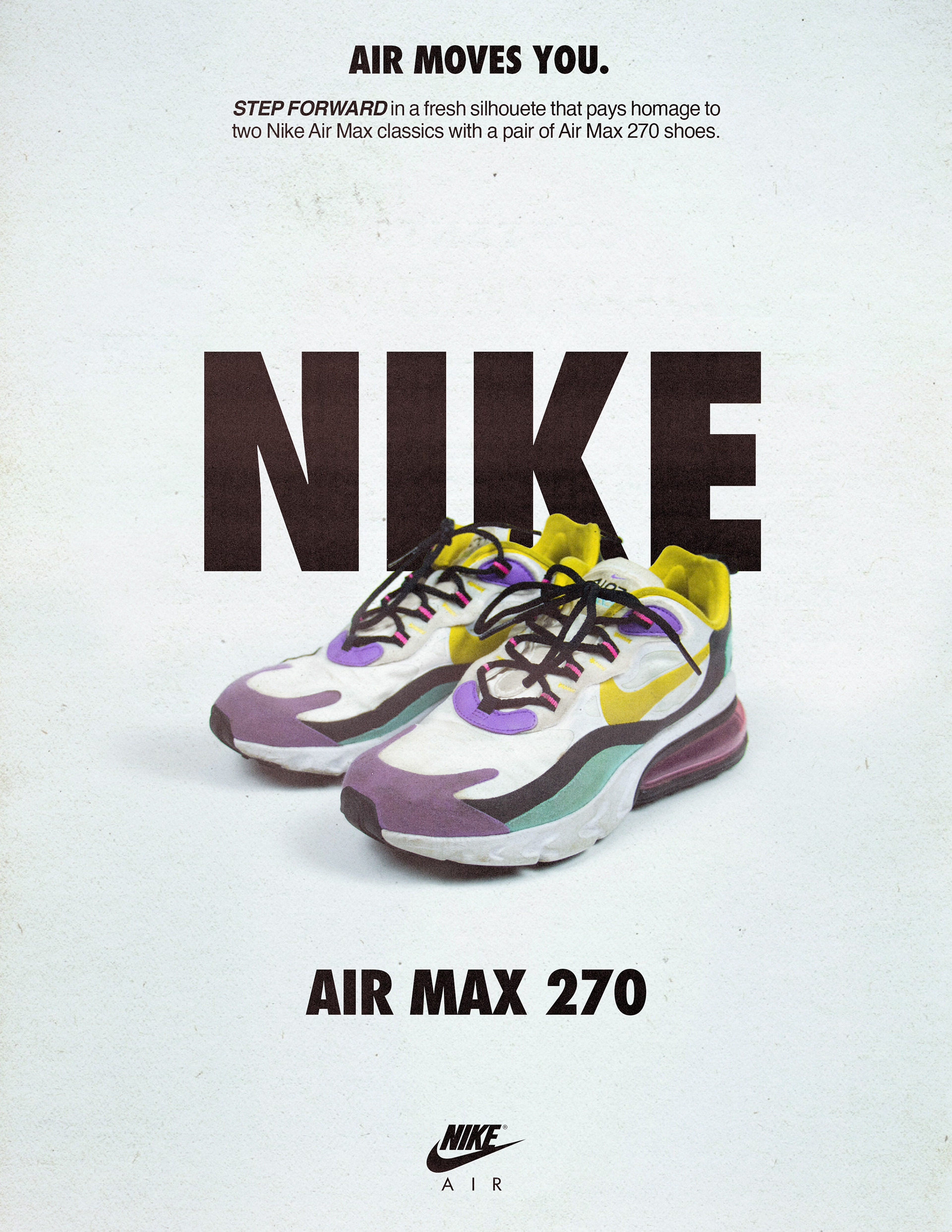
Put a bounce in your step with the Nike Air Max 270. Named for the extra-large Max Air unit that wraps around its heel, these sneakers combine soft cushioning with the sock-like fit of a stretchy inner sleeve. Add a lightweight, airy upper and sporty low-cut collar and you’ve got the perfect kicks for every day.
I was tasked to take live photography of a shoe and turn them into an advertisement for 3 different magazines with different aesthetics and demographics. I took the physical shoes and took some photos using a white and black backdrop and then edited them further in Lightroom. I then took the final edited images into photoshop where I created a retro looking ad for Time Magazine, a minimal and modern ad for People Magazine, and a vibrant and youthful ad for Wired magazine.
I was tasked to take photos around the Fanshawe College Campus to photograph the architecture, the merchandise, and the students (with their consent) to highlight the student life of a Fanshawe student. I took the raw unedited photos in Lightroom and enhanced all the colours especially the red to showcase the school a little bit more. I took the overall brand style guide along with photography and combined it into one unified poster in Illustrator and Photoshop that promotes the school and welcomes back the new students for the upcoming year.


The Daytona 500 is the iconic 500-mile NASCAR Cup Series season-opener held annually at Daytona International Speedway in Daytona Beach, Florida. Considered the most prestigious and important race in NASCAR, the Daytona has opened the NASCAR season every February since 1982. I was tasked to take an image of a race car and remove all the decals and add in new ones through Photoshop. I then took the final car and created a promo with multiple elements that gave the illusion and feeling of speed with blurred lights, and abstract grids and lines.


